



Lockups
The lockup, an elegant combination of Modu Art Space’s logomark and logotype, cohesively conveys the brand identity.

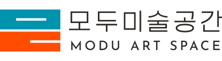
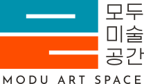
It symbolizes a creative sanctuary celebrated and embraced by all.
The Korean word “modu” carries the dual meaning of “coming together” and “bringing together,” representing a space where all art forms and individuals harmonize.
Equipped with thoughtful accessibility features that ensure a balanced, barrier-free experience, the venue allows everyone to enjoy art in comfort.
The two colors — Modu Blue Green, chosen to be more brilliant and luminous than conventional green or blue, and Modu Orange, boasting a vibrant, charming hue — infuse the modest, honest, and low-key logomark with a vitality that verges on audacity, reflecting Modu Art Space’s identity as a creative venue adored and cherished by everyone.
Logomark
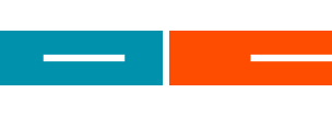
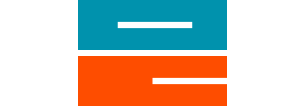
The Korean word “모두 [modu]” means “everyone.” The logomark takes the two Hangeul consonants “ㅁ” and “ㄷ” from this word, reconfigures them into 3:1 aspect-ratio rectangles, and stacks them to create a concise, intuitive visual presentation.
Logotype
The logotype’s crisp, slim layout maximizes the tension between planes and lines, designed to achieve greater harmony when paired with the logomark’s dense, robust graphic.


Color Palette
“Modu Blue Green,” inspired by the green nuance of splendid peacock feathers; “Modu Orange,” a flaming orange that is dynamic and welcoming.
MODU BLUE GREEN
PANTONE® 6129 C
MODU ORANGE
PANTONE® 1655 C
MODU BLACK
PANTONE® BLACK C
MODU WHITE
RGB 255 255 255